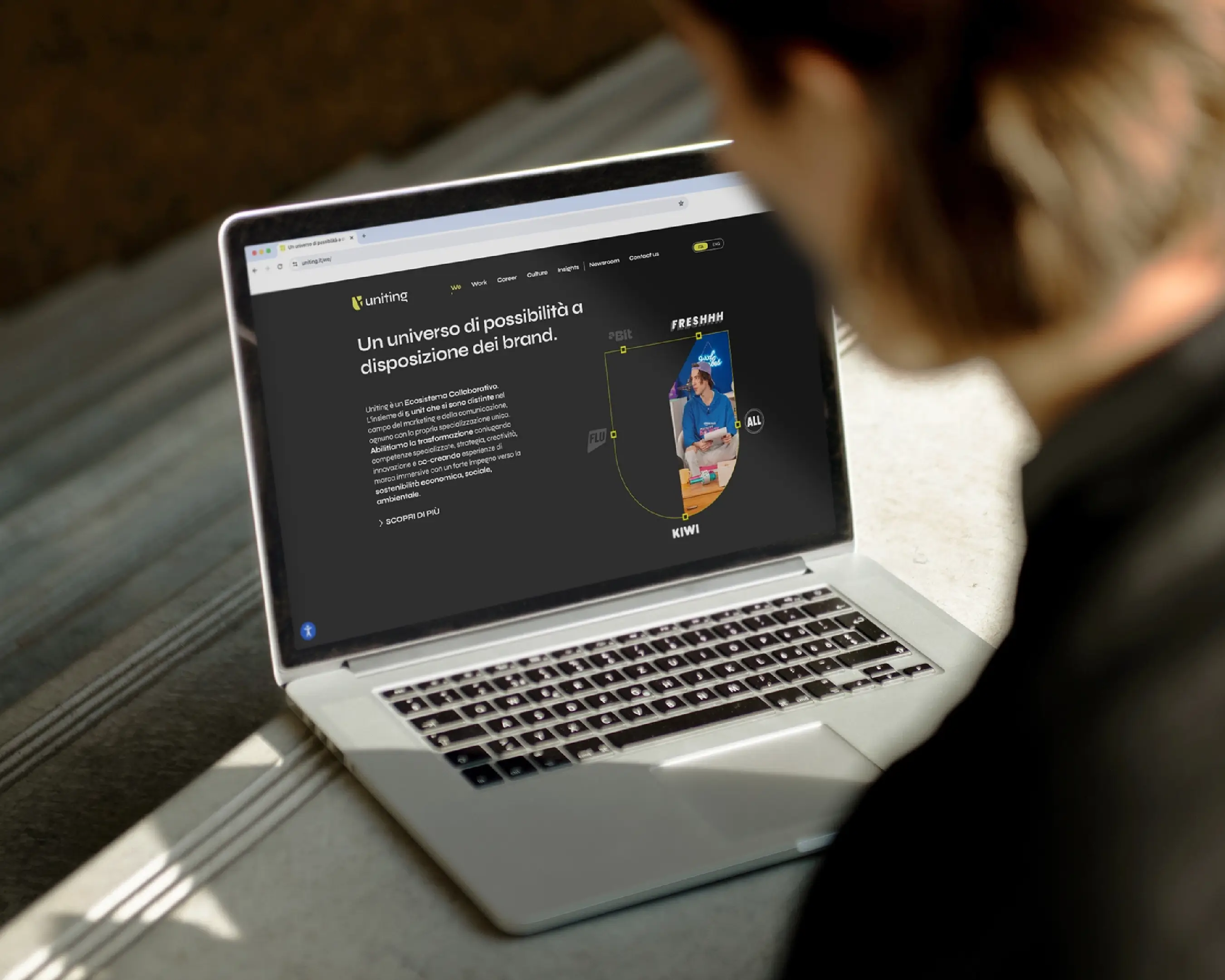
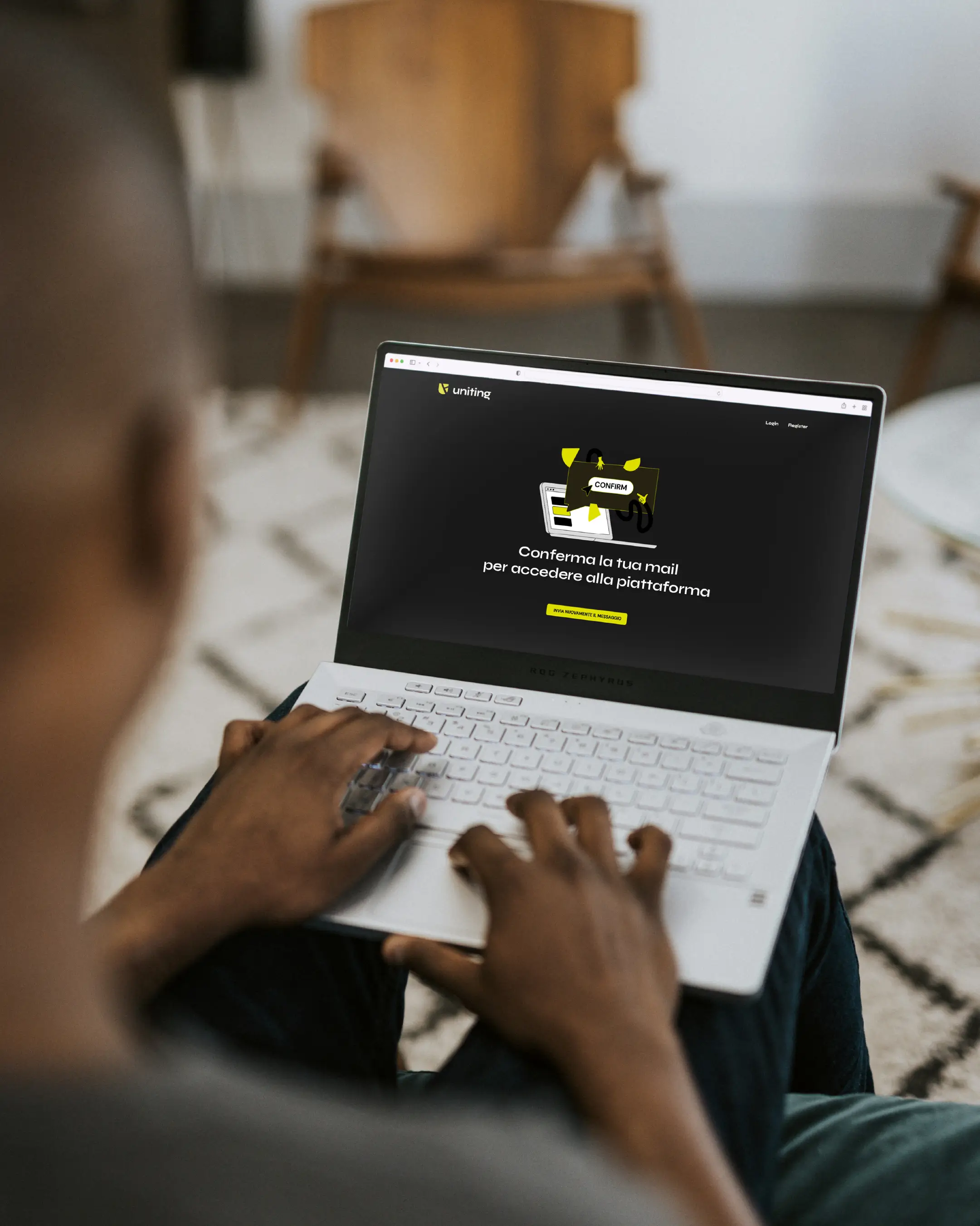
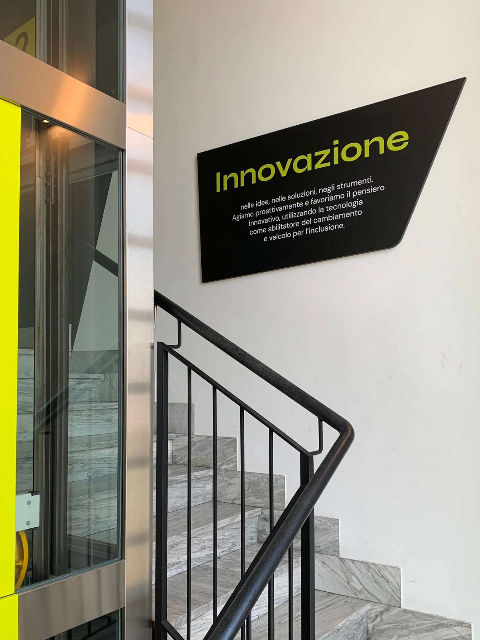
Uniting is a Collaborative Ecosystem made up of five specialized agencies in the fields of marketing and communication — All, Kiwi, Flu, Abit, and Freshhh. Its mission is to bring together expertise, strategy, creativity, and innovation to co-create immersive and meaningful experiences. From the very beginning, we have been by Uniting’s side as brand designers. We developed the entire visual identity and continue to collaborate daily to produce communication artifacts that fully embody and express the brand’s essence.
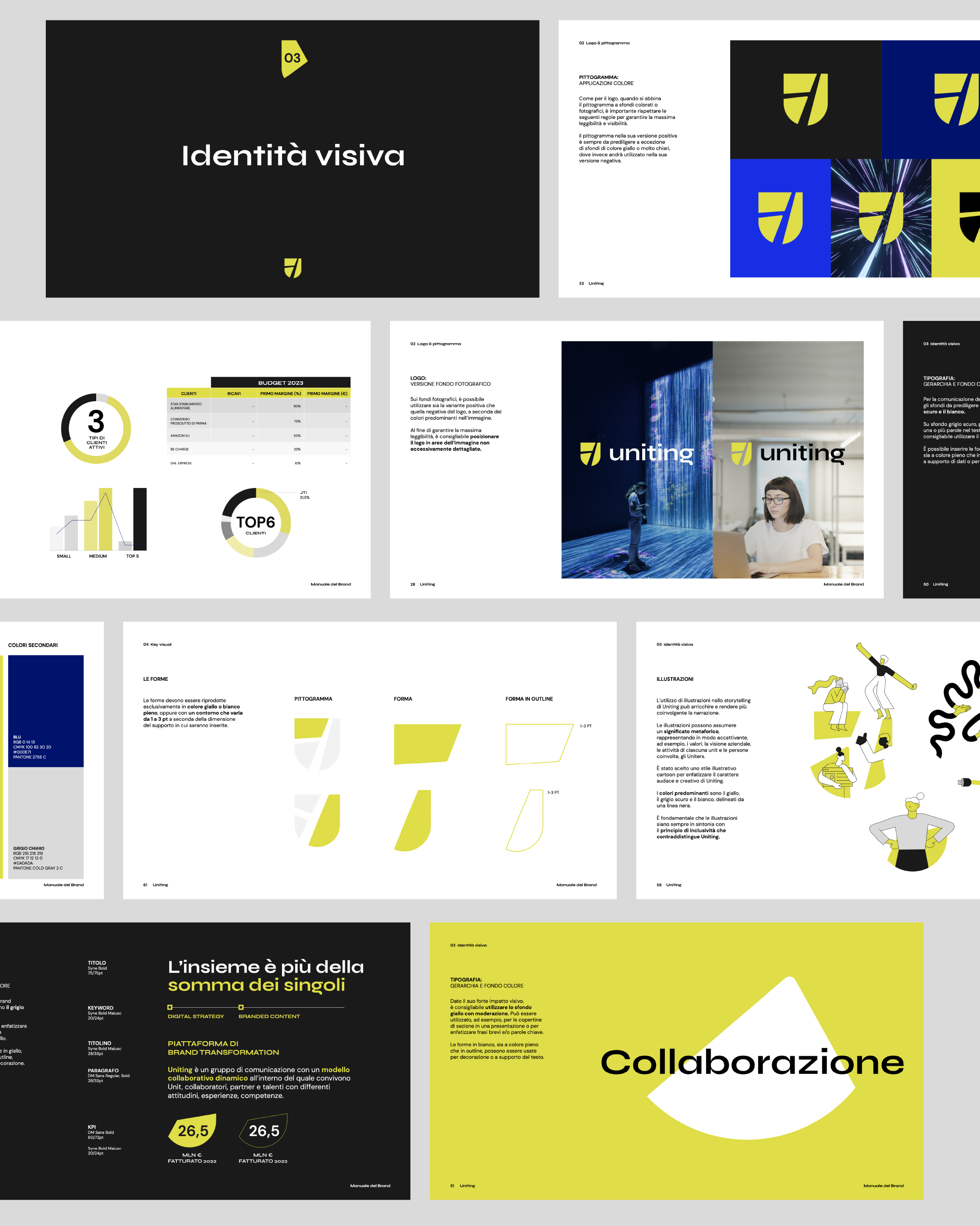
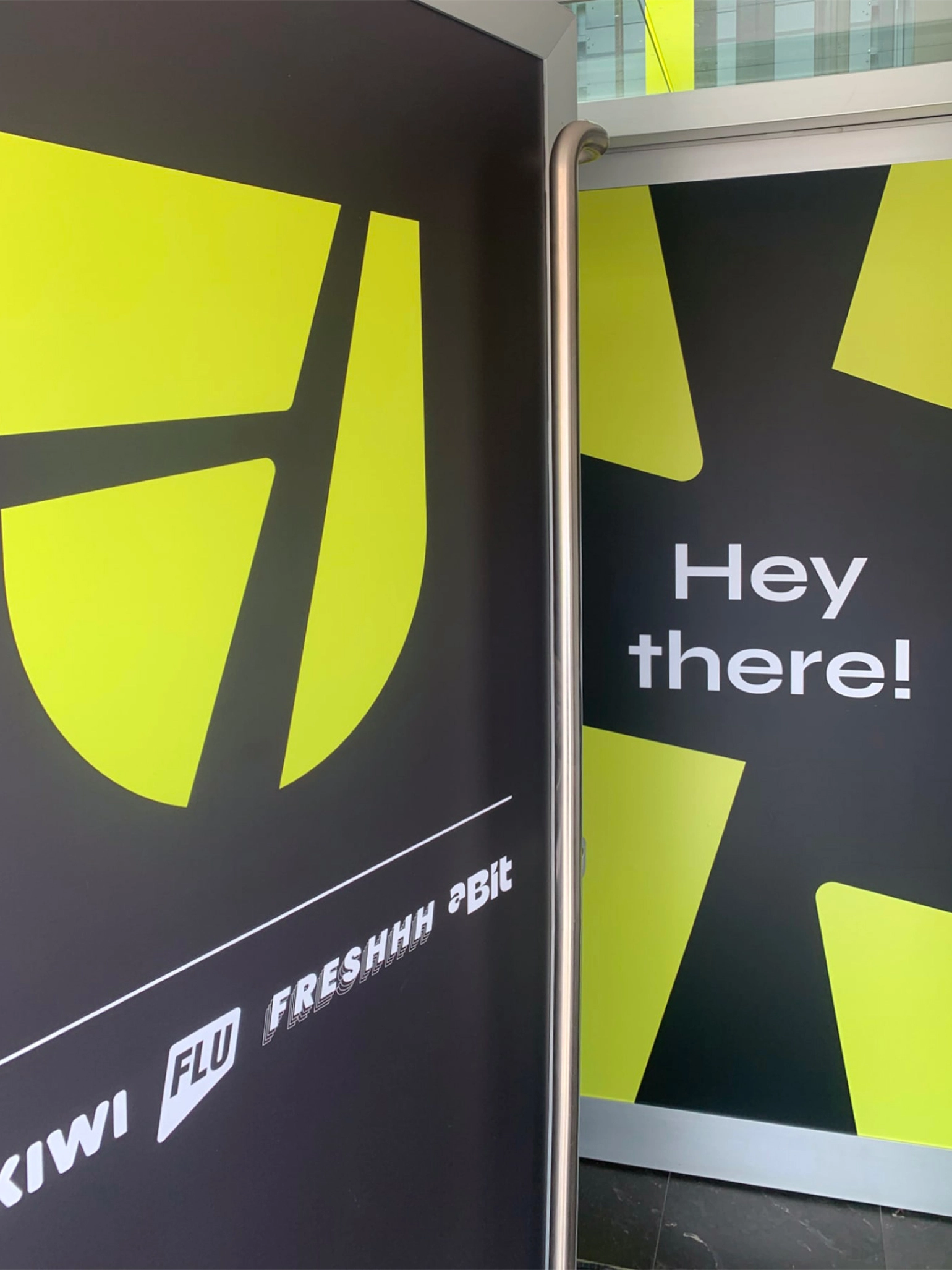
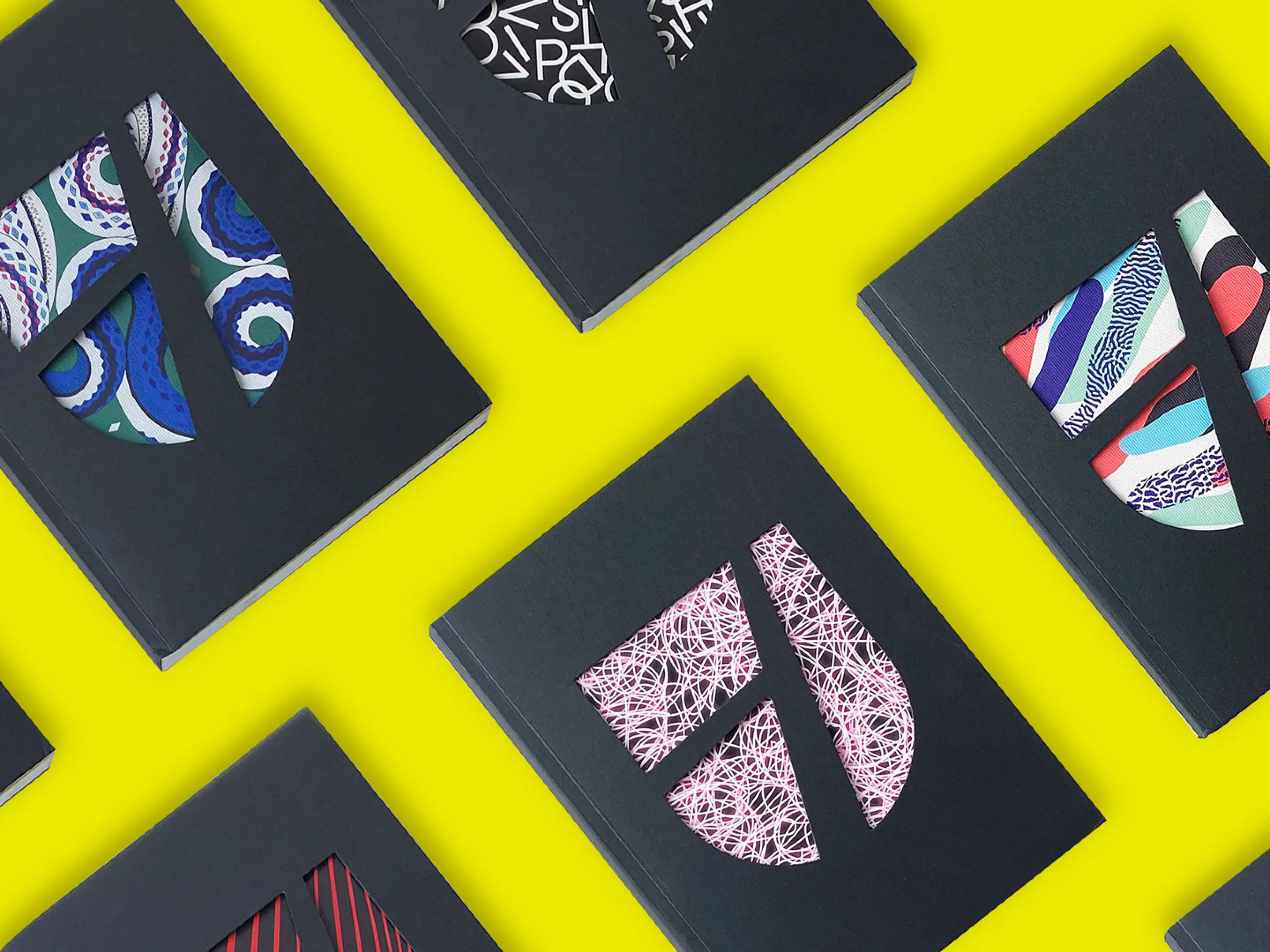
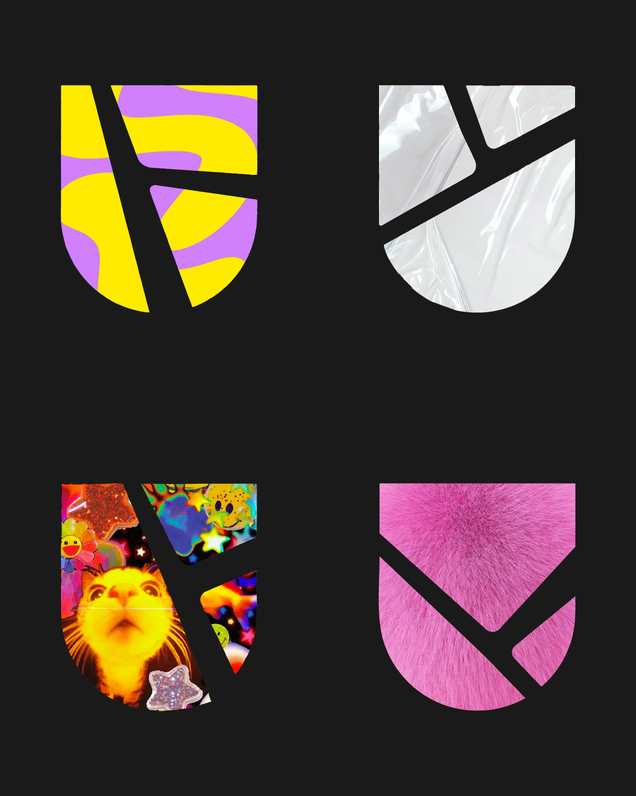
To convey its unique working method — a community-based approach that draws on the strengths of its agencies to design customized, immersive experiences for clients — Uniting needed a strong and distinctive visual symbol. This led to the creation of the logo: a dynamic shield formed by two intersecting lines that generate infinite shapes, representing the limitless possibilities Uniting offers to its stakeholders.
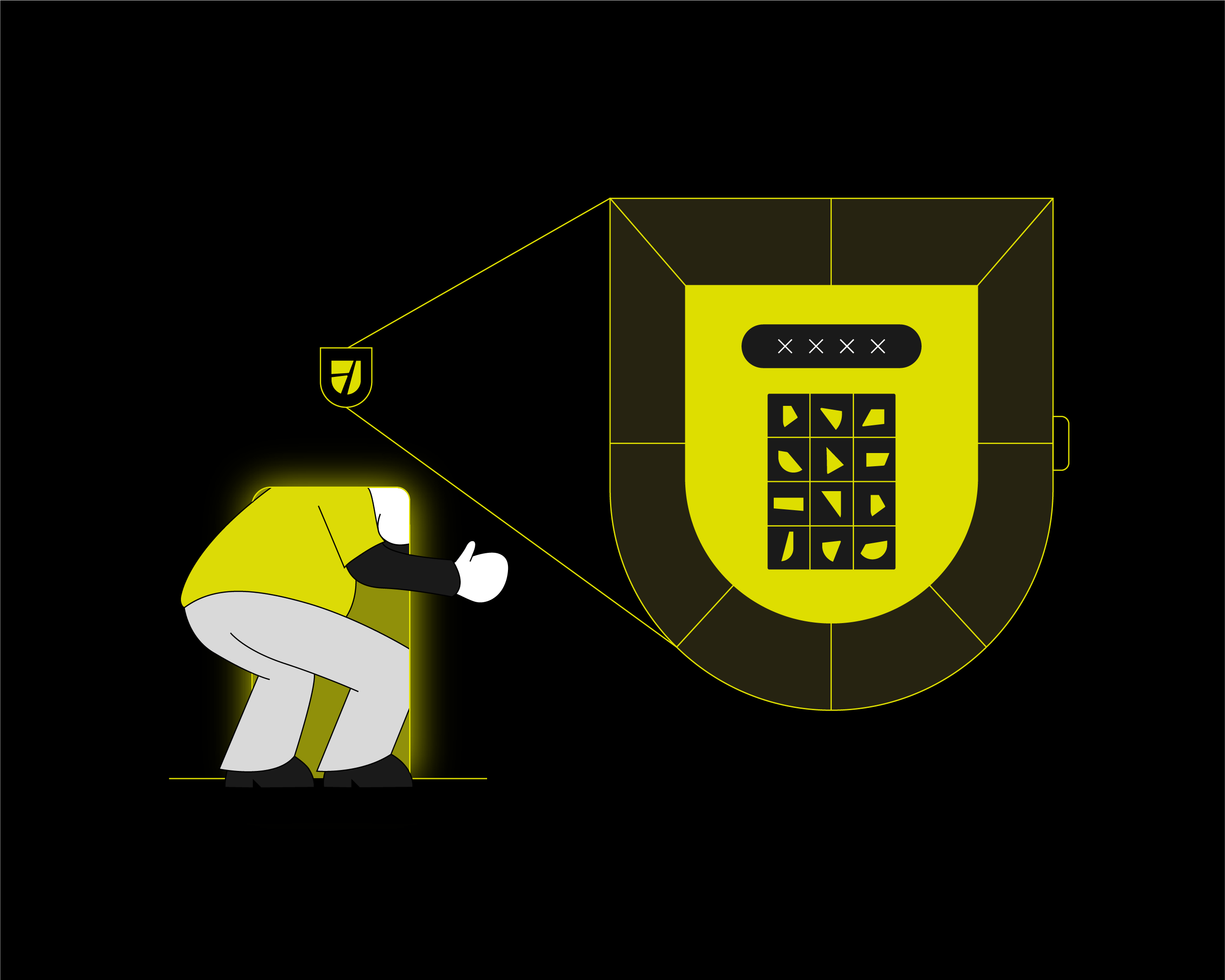
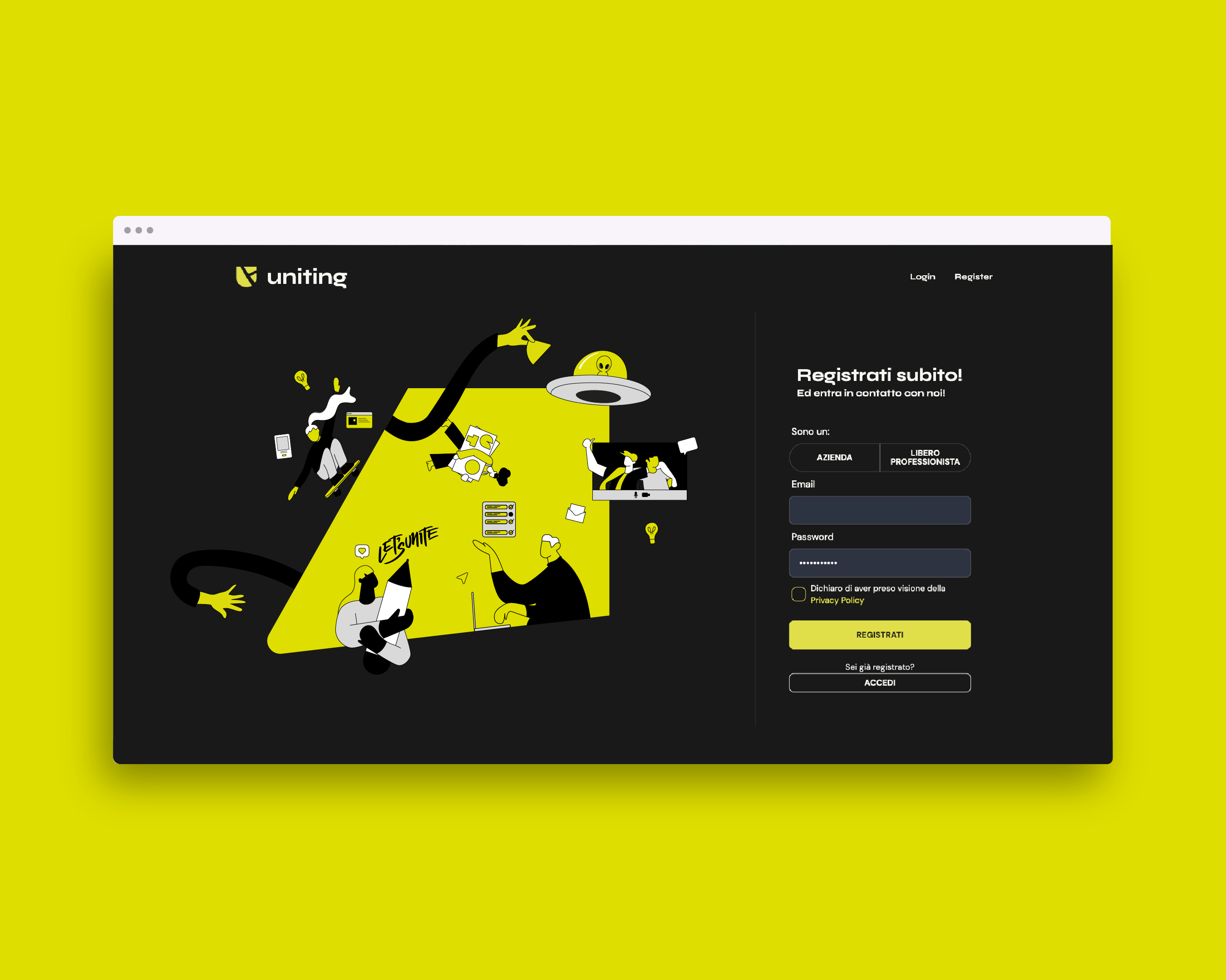
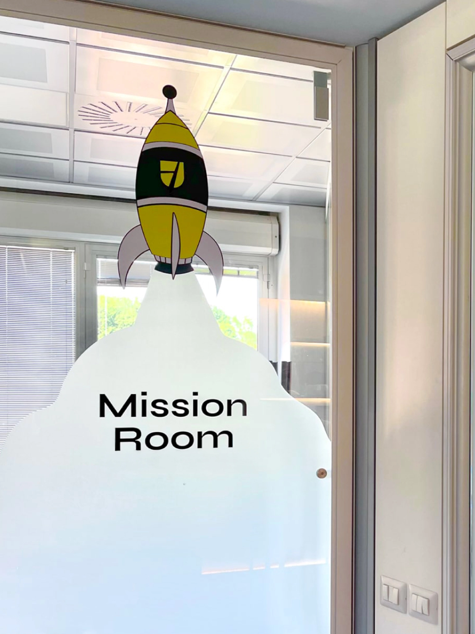
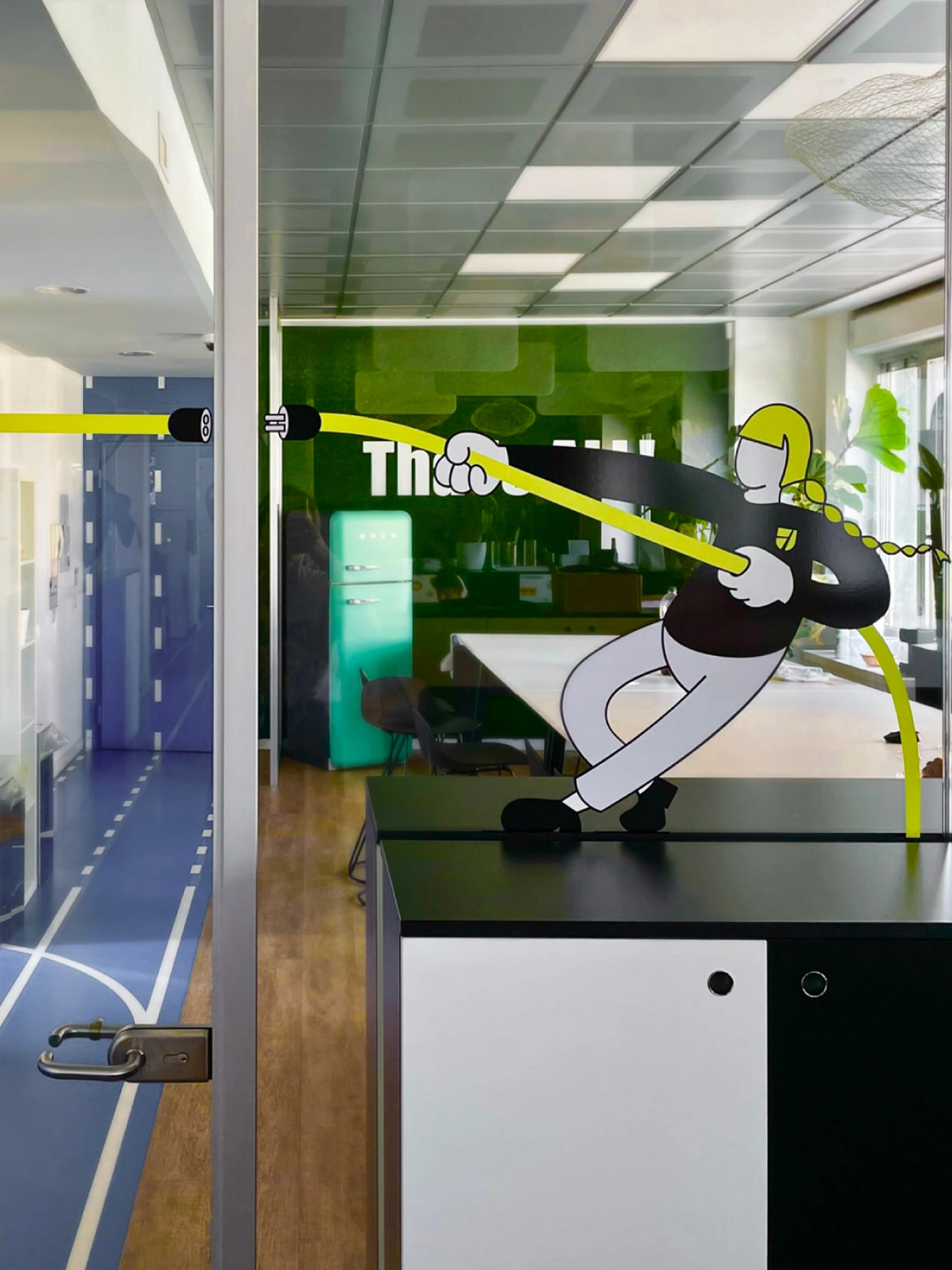
Through this visual identity, we sought to capture and communicate the bold, energetic, and collaborative spirit that defines the Group and its people. The shield and its evolving shapes have become the core visual element of the entire identity system, serving as a versatile and recognizable symbol across all brand expressions. Illustrations also play a key role in the storytelling — they depict the Uniting universe, its values, its collective vision, and above all, the people who bring it to life every day: the Uniters.
credits:
Designed at Studio Fond,
Initial rebranding and web design by Davide Benatti,
Web development by Colla Studio.